Table of Content
- Related Questions
- What is color psychology and how does it affect website design?
- How can I use color psychology to improve my website’s conversion rate?
- Are there any specific colors associated with certain industries or brands?
- What are some common color psychology mistakes to avoid?
- How can I learn more about color psychology and its application in web design?
- Join our newsletter
Did you know that 90% of product judgments are based solely on color? It’s true! Color is a powerful tool that can evoke emotions, influence decisions, and even impact brand perception. This is where the science of color psychology comes into play. Understanding how different colors affect user behavior can be a game changer for your website design.
By leveraging the principles of color psychology, you can create a website that not only looks visually appealing but also resonates with your target audience on a deeper level. This means attracting more visitors, boosting conversions, and ultimately achieving your business goals. In this guide, we’ll explore the psychological effects of different colors, provide practical tips for incorporating them into your website design, and reveal how you can harness the power of color to create a truly impactful online experience.
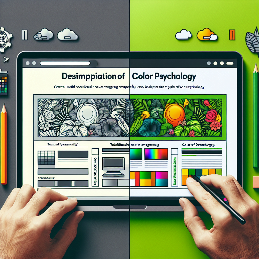
Introduction to Color Psychology
Color psychology, a fascinating field of study, delves into the profound influence of colors on human emotions, behavior, and perception. It explores how different colors evoke distinct feelings and responses, shaping our experiences and interpretations. In the realm of website design, understanding the principles of color psychology is paramount. By strategically employing color, designers can create visually appealing websites that not only engage users but also effectively reinforce brand identity, drive conversions, and ultimately enhance the overall user experience.
Definition of Color Psychology
Color psychology is the study of the psychological effects of colors on human behavior and emotions. It examines how colors influence our perceptions, moods, and preferences, impacting our decisions and actions. This understanding is crucial for designers seeking to create impactful and effective websites that resonate with their target audience.
Importance of Color Psychology
In today’s digital landscape, where online experiences are abundant, websites must stand out to capture and retain user attention. Understanding color psychology is essential for creating a website that engages users, conveys the desired message, and effectively reinforces branding. It allows designers to create visually appealing websites that not only attract visitors but also foster a positive user experience.
How Colors Influence Emotions and Behavior
Colors possess a remarkable power to evoke specific emotions and behaviors, influencing our perception and interpretation of the world around us. This inherent ability makes them a potent tool in website design, where colors can be carefully chosen to create a desired mood, guide user actions, and ultimately enhance the overall user experience.
Color Associations
Colors have strong associations with specific emotions and behaviors, which are often deeply ingrained in our cultural understanding. For example, red is often associated with energy, passion, and urgency, while blue is commonly linked with trust, calmness, and reliability. Understanding these color associations is crucial for designers as they can leverage them to create specific emotional responses and guide user actions on their websites.
Cultural Sensitivity
It’s important to note that color associations can vary significantly across cultures. Colors that hold positive connotations in one culture may carry negative meanings in another. For example, white is associated with purity and mourning in different cultures. Designers must be mindful of cultural differences and consider the global audience they are targeting when selecting colors for their website design.
Applying Color Psychology in Graphic Design
Color plays a vital role in graphic design, where it serves not only as a decorative element but also as a powerful tool for communication and brand identity. By understanding the principles of color theory and their psychological implications, graphic designers can create visually compelling designs that effectively convey messages, evoke desired emotions, and leave a lasting impression on viewers.
Color Theory
Color theory, a fundamental concept in graphic design, provides a framework for understanding the relationships between colors and their effects on perception. It encompasses principles such as color harmonies, color contrasts, and color temperature, which can be strategically applied to create balanced, harmonious, and impactful designs.
Case Studies
Numerous examples demonstrate the successful application of color psychology in graphic design. McDonald’s iconic yellow color scheme instantly evokes feelings of happiness, optimism, and affordability, reflecting the brand’s image. Similarly, Apple’s use of black and white in its branding conveys a sense of clarity, simplicity, and innovation, reflecting the brand’s core values and target audience.
Using Color Psychology in UX Design
User experience (UX) design focuses on creating user-centered digital experiences that are both enjoyable and effective. Color plays a crucial role in UX design, influencing user behavior, guiding their interactions, and shaping their overall perception of the website.
Color Hierarchy
Color hierarchy refers to the strategic use of colors to create visual emphasis and guide user attention. By assigning different colors to various elements on a website, such as buttons, links, and headings, designers can create a clear visual hierarchy that helps users navigate the site and find the information they need quickly and easily.
Accessibility
Accessibility is a critical consideration in UX design, ensuring that websites are usable and accessible to all individuals, regardless of their abilities. This includes considering color blindness and visual impairments, which can significantly impact users’ ability to perceive and interact with website content. Designers should carefully select color combinations that provide sufficient contrast and ensure that all essential elements are easily distinguishable by users with visual impairments.
Strategic Use of Colors in Website Design
Colors are not simply decorative elements; they are powerful tools that can be strategically employed to achieve specific design goals and enhance the overall user experience. By understanding the principles of color psychology, designers can create websites that not only look appealing but also effectively communicate messages, guide user behavior, and reinforce brand identity.
Visual Hierarchy
Visual hierarchy is the arrangement of elements on a webpage based on their importance and prominence. Colors play a crucial role in establishing visual hierarchy, guiding user attention to essential elements and providing a clear path for navigation. Designers can use contrasting colors to highlight important elements like buttons, links, and calls to action, making them stand out and prompting users to take specific actions.
Brand Identity
Brand identity is the unique personality and character of a brand, reflected in its visual elements, such as colors, logos, and fonts. By carefully selecting colors that align with the website’s purpose and target audience, designers can create a strong brand identity that resonates with users and reinforces the brand’s message.
Common Colors Used in Web Design
Certain colors are frequently employed in web design due to their inherent associations with specific emotions and their ability to effectively convey desired messages. Understanding the common uses of these colors can help designers make informed decisions about their color palette and create websites that are both visually appealing and emotionally engaging.
- Blue: Blue is a popular choice for websites, particularly those related to trust, reliability, and calmness. Its association with the sky and the ocean evokes feelings of peace, serenity, and stability. This makes blue an excellent choice for websites promoting products or services that require trust and credibility, such as financial institutions, healthcare providers, and technology companies. Blue is also often used for navigational elements like buttons and links, as it provides a clear visual distinction and promotes a sense of order and clarity.
- Green: Green is associated with nature, health, and growth, making it a common choice for websites promoting environmental consciousness, healthy living, and organic products. It evokes feelings of freshness, renewal, and tranquility, creating a sense of harmony and well-being. Green is often used for websites related to environmental issues, organic food, and healthcare, conveying a sense of responsibility, sustainability, and well-being.
Neutral Colors in Web Design
While bold colors can be used effectively to create visual emphasis and evoke emotions, neutral colors play an equally important role in web design, providing a balanced foundation and creating a sense of harmony and sophistication.
- Gray: Gray, a neutral color, often serves as a backdrop for other colors, providing a sense of balance and sophistication. It can be used to create a modern and minimalist aesthetic, allowing bolder colors to stand out and capture user attention. Gray is often used for backgrounds, text, and borders, providing a neutral canvas for content and visuals.
- White: White, another neutral color, can be used to create a clean and spacious feel, promoting clarity and accessibility. It is often used for backgrounds, text, and borders, providing a high contrast that enhances readability and makes it easier for users to focus on the content. However, using too much white can be overwhelming, so designers often use shades of gray to balance the design and create a more visually appealing experience.
Impact on Customer Conversions
The colors we choose can have a profound impact on our purchasing decisions, influencing our perception of products and brands. Understanding how colors affect customer conversions is crucial for businesses seeking to maximize their online sales and drive customer engagement.
Color Influence
Studies have shown that color can significantly influence a customer’s purchasing decision, with up to 85% of shoppers stating that color is a major factor in their purchase decisions. This highlights the importance of carefully selecting colors for websites, particularly for e-commerce platforms, as it can directly impact conversion rates and ultimately determine a company’s bottom line.
Case Studies
Numerous case studies showcase the impact of color on customer conversions. For instance, a study by the University of Maryland found that shoppers were more likely to purchase products displayed against a red background, suggesting that red can stimulate impulse buying and increase sales. Similarly, a study by the University of California, Berkeley, found that shoppers were more likely to perceive products displayed against a blue background as higher quality, demonstrating the influence of color on perceived value and product appeal.
Best Practices for Using Color Psychology
Successfully applying color psychology requires more than just choosing aesthetically pleasing colors. It involves a comprehensive understanding of the target audience, their color preferences, and the intended message of the website. By following best practices, designers can effectively leverage the power of color to create engaging websites that resonate with users and achieve business objectives.
Research
Conducting thorough research on the target audience is essential for selecting colors that effectively communicate with them and create a positive user experience. Designers should consider the demographics, interests, and cultural background of their target audience, as well as their preferred color associations and any cultural sensitivities.
Consistency
Maintaining a consistent color scheme across the website and all associated marketing materials is crucial for leveraging color psychology effectively. Consistency helps reinforce brand identity, create a cohesive user experience, and ensure that the website’s message is communicated clearly and effectively.
Conclusion
Color psychology is a powerful tool that can transform a website from simply functional to truly engaging and impactful. By carefully selecting colors and understanding their emotional and behavioral implications, designers can create a mood or atmosphere that aligns with the website’s purpose, engages users, and reinforces branding.
Summary
In essence, color psychology is a vital consideration in web design, empowering designers to create visually appealing websites that effectively communicate messages, guide user behavior, and foster a positive user experience. By leveraging the power of color, designers can create websites that not only attract visitors but also resonate with their target audience, driving conversions and ultimately achieving business objectives.
Future Directions
Continued research and application of color psychology principles will continue to refine our understanding of how colors influence human behavior and perception, leading to even more impactful and effective web design. As technology advances and user expectations evolve, the field of color psychology is poised to play an increasingly vital role in shaping the future of digital experiences.
Related Questions
What is color psychology and how does it affect website design?
Color psychology studies how colors influence human behavior and emotions. Website designers use this knowledge to create visually appealing and engaging experiences for users, influencing their perceptions and actions.
How can I use color psychology to improve my website’s conversion rate?
Strategically using colors can boost conversions. For example, using green for call-to-action buttons can evoke trust and encourage clicks, while red can create urgency.
Are there any specific colors associated with certain industries or brands?
Yes, many industries and brands have specific color associations. For instance, blue is often linked with trust and reliability, making it popular for financial institutions.
What are some common color psychology mistakes to avoid?
Overusing bright colors can be overwhelming, while using too many colors can create confusion. Ensure color combinations are harmonious and aligned with your brand’s message.
How can I learn more about color psychology and its application in web design?
There are numerous resources available online and in libraries. You can also consult with a professional web designer who specializes in color theory and psychology.